课程 33 - 布局引擎
浏览器实现了若干布局,例如 Flexbox、Grid、Block,很容易实现类似“居中”这样的效果,无需手动计算指定节点位置。
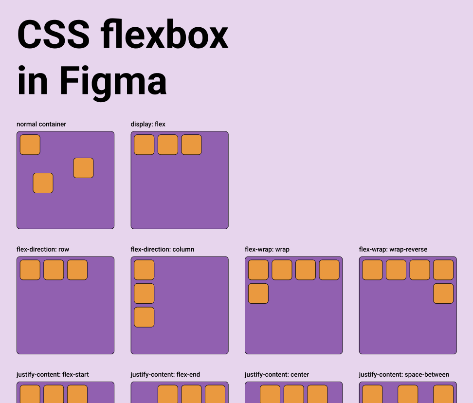
对于脱离了 DOM 的无限画布类应用,就只能自己实现一套布局引擎逻辑了。Figma 实现了 Auto layout,其中 Grid 目前处于测试阶段,而 Vertical 和 Horizontal 就对应了 CSS 的 flex-direction 属性,详见:Figma - Guide to auto layout
专注在设计到代码的工具一般都会提供这个能力,详见:Layout in pencil.dev。
A parent object can take over the sizing and positioning of its children using a flexbox-style layout system via properties like layout, justifyContent and alignItems.
export interface Layout {
    /** Enable flex layout. None means all children are absolutely positioned and will not be affected by layout properties. Frames default to horizontal, groups default to none. */
    layout?: 'none' | 'vertical' | 'horizontal';
    /** The gap between children in the main axis direction. Defaults to 0. */
    gap?: NumberOrVariable;
    layoutIncludeStroke?: boolean;
    /** The Inside padding along the edge of the container */
    padding?:
        | /** The inside padding to all sides */ NumberOrVariable
        | /** The inside horizontal and vertical padding */ [
              NumberOrVariable,
              NumberOrVariable,
          ]
        | /** Top, Right, Bottom, Left padding */ [
              NumberOrVariable,
              NumberOrVariable,
              NumberOrVariable,
              NumberOrVariable,
          ];
    /** Control the justify alignment of the children along the main axis. Defaults to 'start'. */
    justifyContent?:
        | 'start'
        | 'center'
        | 'end'
        | 'space_between'
        | 'space_around';
    /** Control the alignment of children along the cross axis. Defaults to 'start'. */
    alignItems?: 'start' | 'center' | 'end';
}
在本节课中我们将实现 Flexbox 布局,在节点上支持 CSS 同名属性:
const parent = {
    id: 'parent',
    type: 'rect',
    x: 100,
    y: 100,
    width: 200,
    height: 200,
    display: 'flex',
    alignItems: 'center',
    justifyContent: 'center',
};
const child = {
    id: 'child',
    parentId: 'parent',
    type: 'rect',
    width: 50,
    height: 50,
};
Yoga
在前端使用 Yoga 排版引擎只能通过 WASM,目前有几个可用的实现:
- yoga-layout-prebuilt 已经很久没有更新了
- yoga-wasm-web 早期 satori 使用它将 HTML 转换成 SVG,计算布局。taffy 也有相关 示例
- yoga-layout 推荐使用。react-pdf/yoga 使用的就是它,我们的实现也基于它
值得一提的是,Yoga 也适用于 3D 空间,前提是指定应用平面,详见:react-three-flex
Another important difference with DOM Flexbox is that you have to specify the plane of the container in 3D. The elements will be positioned in the 2D plane given by the two axes, using width and height calculated along the two axes.

pixijs/layout
pixijs/layout 也是基于 Yoga 实现的,类似的实现还有 pixi-flex-layout
const container = new Container({
    layout: {
        width: '80%',
        height: '80%',
        gap: 4,
        flexWrap: 'wrap',
        justifyContent: 'center',
        alignContent: 'center',
    },
});
troika-flex-layout
troika-flex-layout,使用 yoga-layout-prebuilt 在 WebWorker 中计算:
import { requestFlexLayout } from 'troika-flex-layout';

// Describe your layout style tree, with a unique id for each node:
const styleTree = {
    id: 'root',
    width: 100,
    height: 100,
    alignItems: 'center',
    justifyContent: 'center',
    children: [
        {
            id: 'child',
            width: '50%',
            height: '50%',
        },
    ],
};

// Initiate a layout request with a callback function:
requestFlexLayout(styleTree, (results) => {
    // The results are a mapping of node ids to layout boxes:
    // {
    //   root: { left: 0, top: 0, width: 100, height: 100 },
    //   child: { left: 25, top: 25, width: 50, height: 50 }
    // }
});
Yoga 之外的选择
纯 JS 实现:
- Motion Canvas Layouts 基于浏览器原生的 Flexbox 实现,无需重新实现复杂的布局算法
- Simplifying WebGL: Building an Effective Layout Engine
Rust 实现:
- stretch 实现了 Flexbox,也提供了
stretch-layoutWASM 绑定,但已经很久没有维护了 - taffy 一个用 Rust 编写的高性能 UI 布局库,目前实现了几种 CSS 布局算法,包括了 Flexbox、Grid 和 Block。但暂时没有 WASM 绑定,详见:taffy wasm bindings
实现
我们选择 Yoga 官方的 yoga-layout,其实除了我们熟悉的 Flexbox,它还提供了类似 Margin 和 Padding 等基础布局属性。
import { loadYoga } from 'yoga-layout/load';

class YogaSystem extends System {
    async prepare() {
        Yoga = await loadYoga();
    }
}
首先需要构造一棵平行于场景图的布局树,它的节点结构如下:
interface StyleTreeNode {
    id: string;
    top?: number | string;
    left?: number | string;
    width?: number | string;
    height?: number | string;
    children: StyleTreeNode[];
    padding?: number | number[];
    margin?: number | number[];
    gap?: number;
    rowGap?: number;
    columnGap?: number;
}
然后在合适的时机将布局树转换成 Yoga 树,完成布局计算并应用到场景图节点上:
const root = Yoga.Node.createWithConfig(yogaConfig);
populateNode(root, styleTree);

root.calculateLayout();
const results = Object.create(null);
walkStyleTree(styleTree, (styleNode) => {
    const { id, yogaNode } = styleNode;
    results[id] = {
        x: yogaNode.getComputedLeft(),
        y: yogaNode.getComputedTop(),
        width: yogaNode.getComputedWidth(),
        height: yogaNode.getComputedHeight(),
    };
});
root.freeRecursive();
布局计算时机
当 Flexbox 容器自身的尺寸发生变化时,需要重新计算布局,对其子元素的位置和尺寸应用。另外,当新的子元素加入容器时,也需要重新计算。
class YogaSystem extends System {
    private readonly bounds = this.query((q) =>
        q.addedOrChanged.and.removed
            .with(ComputedBounds)
            .trackWrites.and.with(Flex),
    );

    execute() {
        this.bounds.addedOrChanged.forEach((entity) => {
            // relayout
        });
    }
}
AlignItems & JustifyContent
最常用的就是利用这两个属性完成居中:
很容易实现按钮:
Gap
下面这个例子展示了 padding 和 gap 的效果:
const parent = {
    id: 'yoga-gap-parent',
    type: 'rect',
    x: 100,
    y: 100,
    width: 200,
    height: 250,
    fill: 'grey',
    display: 'flex',
    padding: 10,
    flexWrap: 'wrap',
    gap: 10,
    zIndex: 0,
};
Flex Basis, Grow, and Shrink
Flex grow accepts any floating point value >= 0, with 0 being the default value. A container will distribute any remaining space among its children weighted by the child’s flex grow value.
Min/Max Width and Height
Hug contents
在某一轴或两轴上,父级不给出(或只给部分)外扩尺寸,由子级测量结果 + padding/gap 决定父级宽高。这在 Figma 中称作 Hug contents。
而在 Yoga 的实现中,只要不把节点设成固定宽高,就会根据子节点算出父节点的尺寸,当然前提是子节点可以被测量,Yoga 会在布局后给出容器的 getComputedWidth() / getComputedHeight(),这就是「由内容撑开父级」。
导出 SVG
由于 CSS Flexbox 只支持 HTML 元素作为容器,SVG 元素不可以。因此在导出 SVG 时,仍然需要使用布局之后的绝对位置。
const layoutNodes = api.readLayoutFromECS(nodes);

(await serializeNodesToSVGElements(layoutNodes)).forEach((element) => {
    $namespace.appendChild(element);
});