Lesson 33 - Layout engine
Browsers implement several layout systems, such as Flexbox, Grid, and Block, making it easy to achieve effects like “centering” without manually calculating node positions.
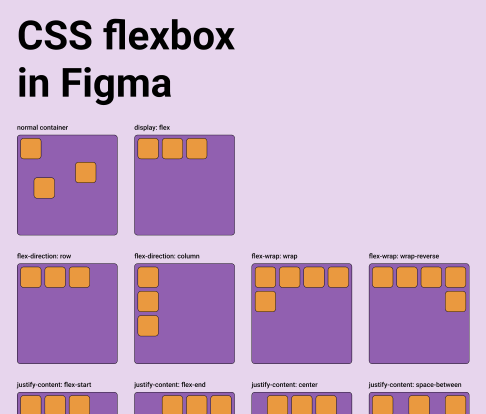
For infinite canvas-like applications operating outside the DOM, you must implement your own layout engine logic. Figma has implemented Auto Layout, where Grid is currently in beta, while Vertical and Horizontal correspond to CSS's flex-direction property. For details, see: Figma - Guide to auto layout
Tools focused on design-to-code typically provide this capability. For details, see: Layout in pencil.dev
A parent object can take over the sizing and positioning of its children using a flexbox-style layout system via properties like layout, justifyContent and alignItems.
export interface Layout {
    /** Enable flex layout. None means all children are absolutely positioned and will not be affected by layout properties. Frames default to horizontal, groups default to none. */
    layout?: 'none' | 'vertical' | 'horizontal';
    /** The gap between children in the main axis direction. Defaults to 0. */
    gap?: NumberOrVariable;
    layoutIncludeStroke?: boolean;
    /** The Inside padding along the edge of the container */
    padding?:
        | /** The inside padding to all sides */ NumberOrVariable
        | /** The inside horizontal and vertical padding */ [
              NumberOrVariable,
              NumberOrVariable,
          ]
        | /** Top, Right, Bottom, Left padding */ [
              NumberOrVariable,
              NumberOrVariable,
              NumberOrVariable,
              NumberOrVariable,
          ];
    /** Control the justify alignment of the children along the main axis. Defaults to 'start'. */
    justifyContent?:
        | 'start'
        | 'center'
        | 'end'
        | 'space_between'
        | 'space_around';
    /** Control the alignment of children along the cross axis. Defaults to 'start'. */
    alignItems?: 'start' | 'center' | 'end';
}
In this lesson, we will implement Flexbox layouts and support CSS properties with the same names on nodes:
const parent = {
    id: 'parent',
    type: 'rect',
    x: 100,
    y: 100,
    width: 200,
    height: 200,
    display: 'flex',
    alignItems: 'center',
    justifyContent: 'center',
};
const child = {
    id: 'child',
    parentId: 'parent',
    type: 'rect',
    width: 50,
    height: 50,
};
Yoga
Using the Yoga layout engine in the frontend is only possible via WASM. Currently, there are several available implementations:
- yoga-layout-prebuilt It's been a long time since the last update.
- yoga-wasm-web Early satori used it to convert HTML into SVG and compute layouts. taffy also has related example
- yoga-layout We recommend using it, and our implementation is also based on it. react-pdf/yoga also use it.
It is worth noting that Yoga also applies to 3D space, provided that a plane is specified. For details, see:react-three-flex
Another important difference with DOM Flexbox is that you have to specify the plane of the container in 3D. The elements will be positioned in the 2D plane given by the two axes, using width and height calculated along the two axes.

pixijs/layout
pixijs/layout is also implemented using Yoga. Similar implementations include: pixi-flex-layout
const container = new Container({
    layout: {
        width: '80%',
        height: '80%',
        gap: 4,
        flexWrap: 'wrap',
        justifyContent: 'center',
        alignContent: 'center',
    },
});
troika-flex-layout
troika-flex-layout, computed in a WebWorker using yoga-layout-prebuilt:
import { requestFlexLayout } from 'troika-flex-layout';

// Describe your layout style tree, with a unique id for each node:
const styleTree = {
    id: 'root',
    width: 100,
    height: 100,
    alignItems: 'center',
    justifyContent: 'center',
    children: [
        {
            id: 'child',
            width: '50%',
            height: '50%',
        },
    ],
};

// Initiate a layout request with a callback function:
requestFlexLayout(styleTree, (results) => {
    // The results are a mapping of node ids to layout boxes:
    // {
    //   root: { left: 0, top: 0, width: 100, height: 100 },
    //   child: { left: 25, top: 25, width: 50, height: 50 }
    // }
});
Alternatives to Yoga
Pure JS implementations:
- Motion Canvas Layouts Native browser-based Flexbox implementation, eliminating the need to reimplement complex layout algorithms
- Simplifying WebGL: Building an Effective Layout Engine
Rust implementations:
- stretch implements Flexbox and provides a
stretch-layoutWASM binding, but it has not been maintained for a long time. - taffy A high-performance UI layout library written in Rust, currently implementing several CSS layout algorithms including Flexbox, Grid, and Block. However, WASM bindings are not yet available. For details, see: taffy wasm bindings
Our implementation
We chose the official yoga-layout. Besides the familiar Flexbox, it also provides basic layout properties such as Margin and Padding.
import { loadYoga } from 'yoga-layout/load';

class YogaSystem extends System {
    async prepare() {
        Yoga = await loadYoga();
    }
}
A layout tree parallel to the scene graph needs to be constructed.
First, we need to build a layout tree parallel to the scene graph. Its node structure is as follows:
interface StyleTreeNode {
    id: string;
    top?: number | string;
    left?: number | string;
    width?: number | string;
    height?: number | string;
    children: StyleTreeNode[];
    padding?: number | number[];
    margin?: number | number[];
    gap?: number;
    rowGap?: number;
    columnGap?: number;
}
Then at the right time, convert the layout tree into a Yoga tree, run the layout computation, and apply the results to the scene graph nodes:
const root = Yoga.Node.createWithConfig(yogaConfig);
populateNode(root, styleTree);

root.calculateLayout();
const results = Object.create(null);
walkStyleTree(styleTree, (styleNode) => {
    const { id, yogaNode } = styleNode;
    results[id] = {
        x: yogaNode.getComputedLeft(),
        y: yogaNode.getComputedTop(),
        width: yogaNode.getComputedWidth(),
        height: yogaNode.getComputedHeight(),
    };
});
root.freeRecursive();
When to do layout
When the Flexbox container’s own size changes, layout must be recomputed and applied to its children’s positions and sizes. Likewise when new children are added to the container.
class YogaSystem extends System {
    private readonly bounds = this.query((q) =>
        q.addedOrChanged.and.removed
            .with(ComputedBounds)
            .trackWrites.and.with(Flex),
    );

    execute() {
        this.bounds.addedOrChanged.forEach((entity) => {
            // relayout
        });
    }
}
AlignItems & JustifyContent
The most common use is centering content with these two properties:
To implement buttons with centered text:
Gap
The following example demonstrates the effect of padding and gap:
const parent = {
    id: 'yoga-gap-parent',
    type: 'rect',
    x: 100,
    y: 100,
    width: 200,
    height: 250,
    fill: 'grey',
    display: 'flex',
    padding: 10,
    flexWrap: 'wrap',
    gap: 10,
    zIndex: 0,
};
Flex Basis, Grow, and Shrink
Flex grow accepts any floating point value >= 0, with 0 being the default value. A container will distribute any remaining space among its children weighted by the child’s flex grow value.
Min/Max Width and Height
Export SVG
Since CSS Flexbox only supports HTML elements as containers and not SVG elements, absolute positions after layout must still be used when exporting to SVG.
const layoutNodes = api.readLayoutFromECS(nodes);

(await serializeNodesToSVGElements(layoutNodes)).forEach((element) => {
    $namespace.appendChild(element);
});